
Colour Theory in Web Design: Strategic UX & Conversion Guide
Colour theory in web design shapes how visitors experience your website, process information, and take action online. Choosing the right palette goes beyond visual appeal—it influences emotional responses, user engagement, and conversion rates. Understanding basic colour dynamics allows designers and business owners to build intuitive, accessible, and high-performing digital experiences.
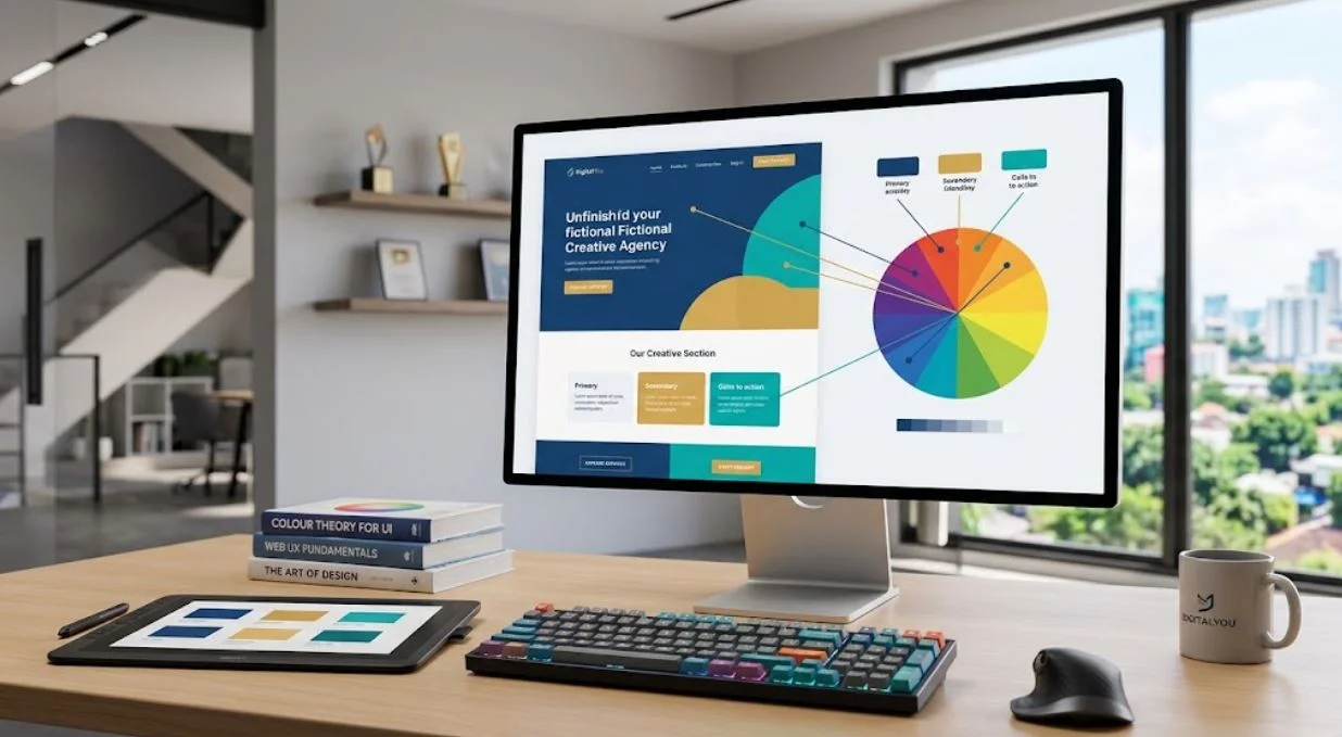
Understanding the Foundations of Colour Theory in Modern Digital Interfaces
Colour theory in web design rests on three primary pillars: hue, value, and saturation. Hue refers to the pure color itself (such as red, blue, or yellow), value indicates how light or dark that color appears, and saturation measures its intensity or purity. When applied to digital interfaces, these core elements dictate visual hierarchy and direct user focus across a webpage.
In modern UI/UX design, colour harmony determines how harmoniously individual shades interact. Designers rely on tested palette structures to ensure balance across complex layouts:
-
Monochromatic: Variations in lightness and saturation of a single hue, creating a clean, cohesive, and minimal look.
-
Analogous: Colors sitting adjacent on the color wheel (e.g., blue, blue-green, and green), delivering a serene and naturally comfortable visual flow.
-
Complementary: High-contrast pairings from opposite sides of the color wheel (e.g., blue and orange), ideal for call-to-action (CTA) buttons that require immediate attention.
-
Triadic: Three colors evenly spaced around the wheel, offering vibrant contrast while maintaining balance when one shade dominates.
Applying these foundations creates clear visual pathways. A well-structured palette guides the reader’s eye effortlessly from key headlines to essential navigation links and final conversion goals.
Applying the 60-30-10 Rule for Balanced Web Layouts
“Design is not just what it looks like and feels like. Design is how it works.” — Steve Jobs
This iconic principle applies directly to colour application. The classic 60-30-10 rule ensures that visual hierarchy supports website functionality without overwhelming the user:
-
60% Dominant Colour: Used for neutral backgrounds, canvas space, and main layout cards.
-
30% Secondary Colour: Applied to structural elements, typography, subheadings, and secondary containers.
-
10% Accent Colour: Saved exclusively for interactive triggers, primary buttons, conversion links, and notice badges.
By keeping high-contrast accent shades strictly within that 10% threshold, websites establish a clear visual priority that directly boosts usability.
Psychological Impact of Colours on Web Conversions
Every colour triggers distinct psychological and emotional reactions that influence online behavior:
-
Blue: Conveys security, trust, and professionalism. Widely used by financial institutions, SaaS platforms, and corporate brands.
-
Green: Signals growth, health, sustainability, and positive action. Highly effective for checkout confirmations and eco-friendly products.
-
Red: Evokes urgency, passion, and energy. Excellent for limited-time offers, error states, and high-priority alerts.
-
Yellow/Orange: Represents optimism, warmth, and enthusiasm. Frequently used to draw attention to secondary actions and banners.
-
Black/Dark Gray: Associated with luxury, sophistication, and modern elegance. Commonly featured in high-end commerce and portfolio sites.
Selecting a brand palette requires matching these psychological triggers with visitor expectations to build instant trust.
Accessibility, Contrast Ratios, and WCAG Standards
A visually striking website fails if users cannot comfortably read its content. The Web Content Accessibility Guidelines (WCAG 2.2) outline clear contrast ratios to ensure digital content remains accessible to everyone, including individuals with visual impairments or color blindness:
Level Text Type Minimum Contrast Ratio Target Purpose AA Normal Text 4.5:1 Standard web readability standard AA Large Text (18pt+) 3.0:1 Headings and large interface elements AAA Normal Text 7.0:1 Enhanced accessibility compliance AAA Large Text (18pt+) 4.5:1 Enhanced readability for large text Designers evaluate these ratios using public testing frameworks such as the W3C Web Accessibility Initiative Resources, ensuring compliance across both desktop and mobile screens.
Dark Mode Dynamics and System-Aware Palettes
Dark mode has evolved from an aesthetic trend into an essential user experience feature. Adapting a light palette for dark mode requires more than simply inverting colors:
-
Avoid Pure Black (
#000000): Extreme contrast against pure white text causes visual eye strain (halation). Use deep dark grays (#121212or#1E1E1E) for softer backgrounds. -
Desaturate Vibrant Colours: Bright accent colors that look balanced on white backgrounds can bleed and vibrate against dark surfaces. Lowering saturation improves legibility.
-
Layer Depth with Tonal Grays: Instead of relying solely on drop shadows to show elevation, use lighter gray surfaces for cards floating over dark backgrounds.
Refer to the official Google Material Design Color Guidelines to inspect system-level recommendations for dynamic daylight and night-mode theme implementation.
Integrating Colour Theory into Modern Web Development
Applying colour theory effectively requires aligning design choices with clean technical execution. Responsive framework tokens, dark-mode variables, and CSS custom properties allow developers to manage theme switches seamlessly across all viewports.
When building bespoke layouts, combining strategic design choices with performance-focused development ensures fast load times and clean user interaction. Exploring professional Graphic Design Services helps establish a cohesive visual language before writing code. Additionally, implementing these designs within robust platforms—such as tailored WordPress Development Solutions—guarantees that color management remains responsive, accessible, and easy to update over time.
-
Final Thought
Colour theory in web design bridges creative art and conversion science. By combining harmonious palettes with accessible contrast, logical visual hierarchy, and smooth theme switching, websites transform into intuitive digital experiences that hold attention and build user trust. If you want to refine your digital presence, update an existing brand identity, or build a high-converting online platform, Contact Digital You today to discover how tailored design and strategy can grow your business.